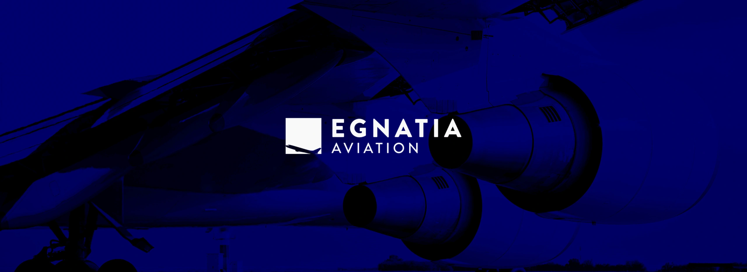
Egnatia Aviation – Corporate Identity Design
Egnatia Aviation, one of Europe’s leading Pilot Schools, contacted Artware to renew its corporate identity, within the wider image and communication strategy renewal. Our goal was to turn the corporate identity into a medium that sends a clear and consistent message of “who we are”, creating a strong and unified image of the company.
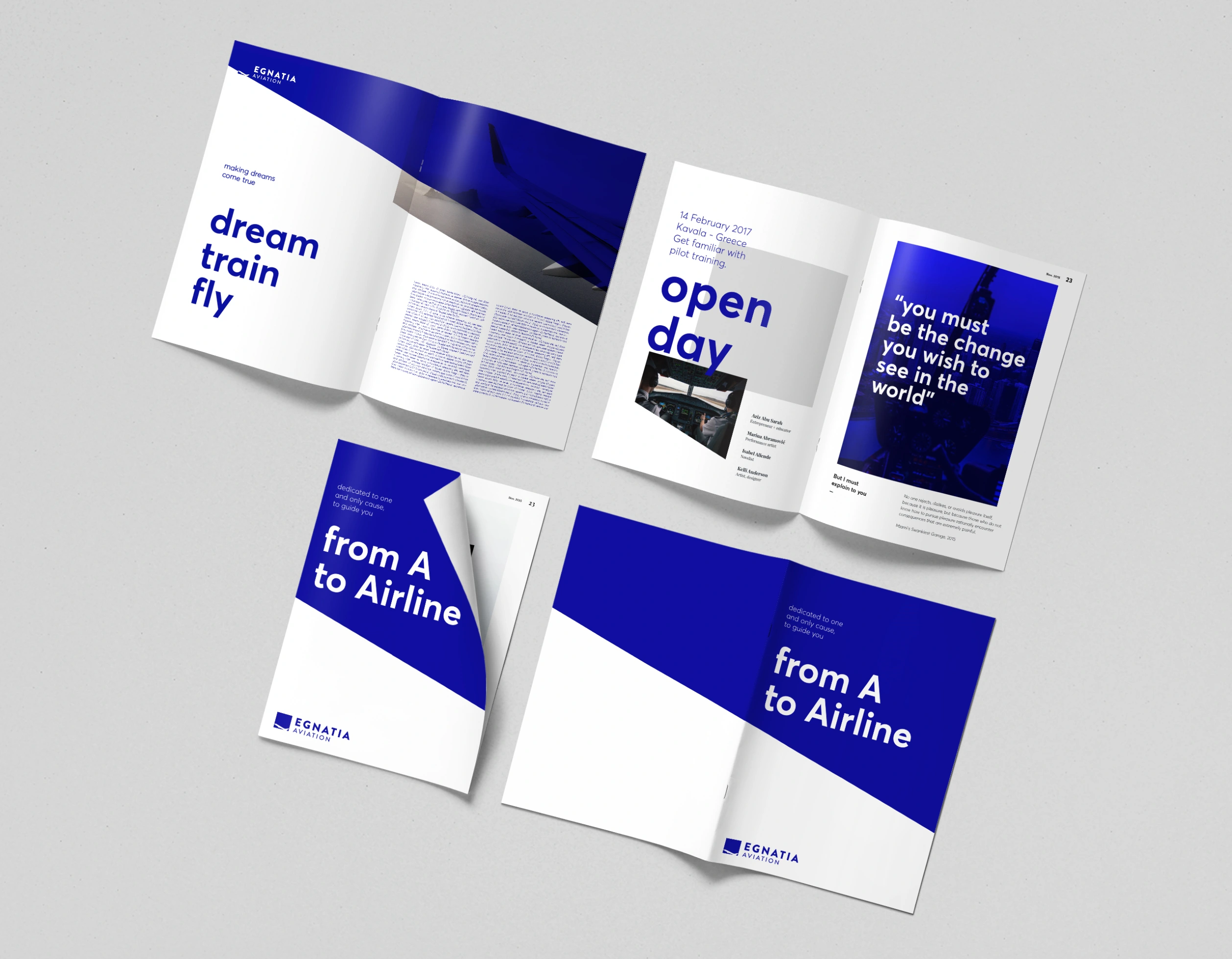
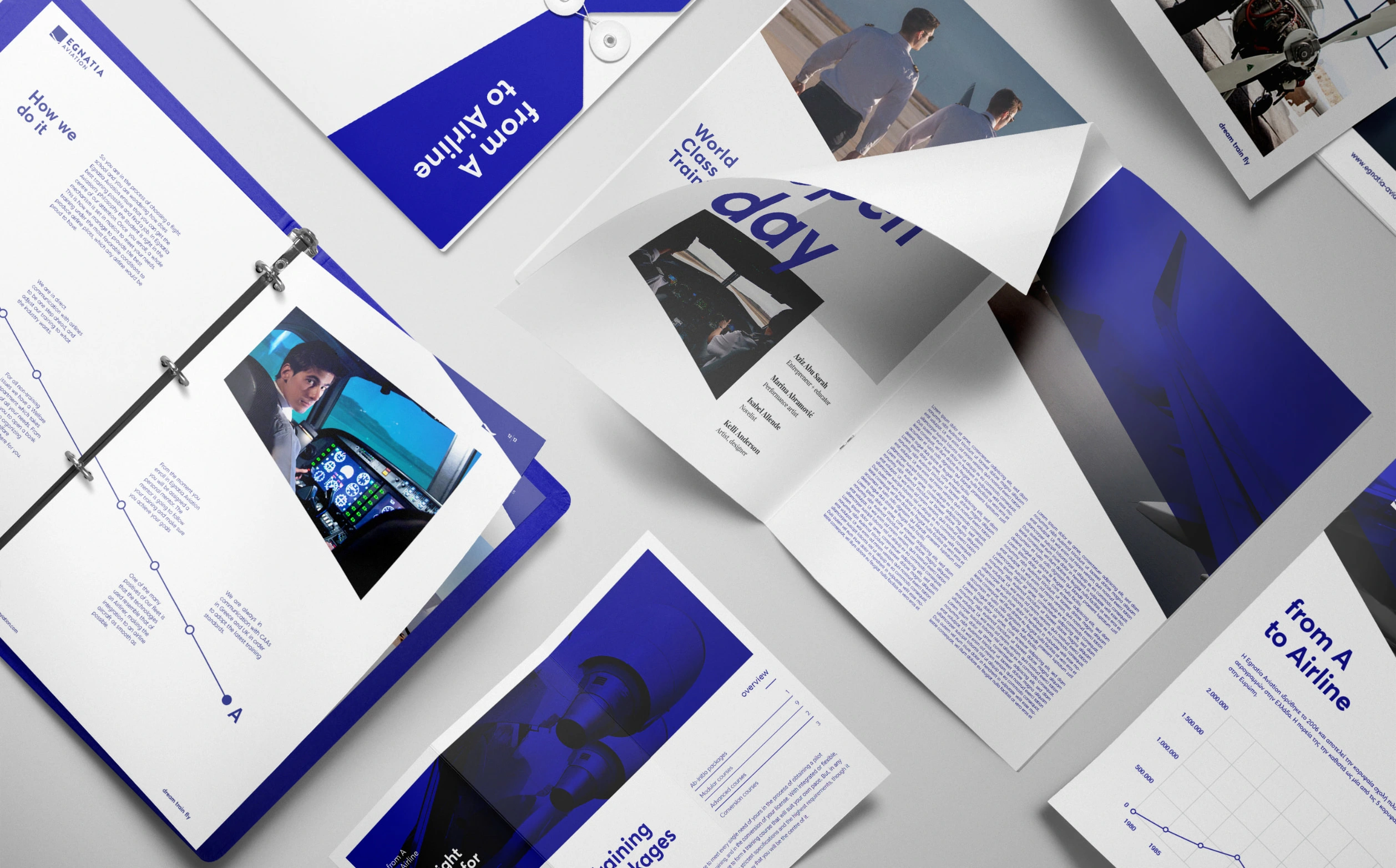
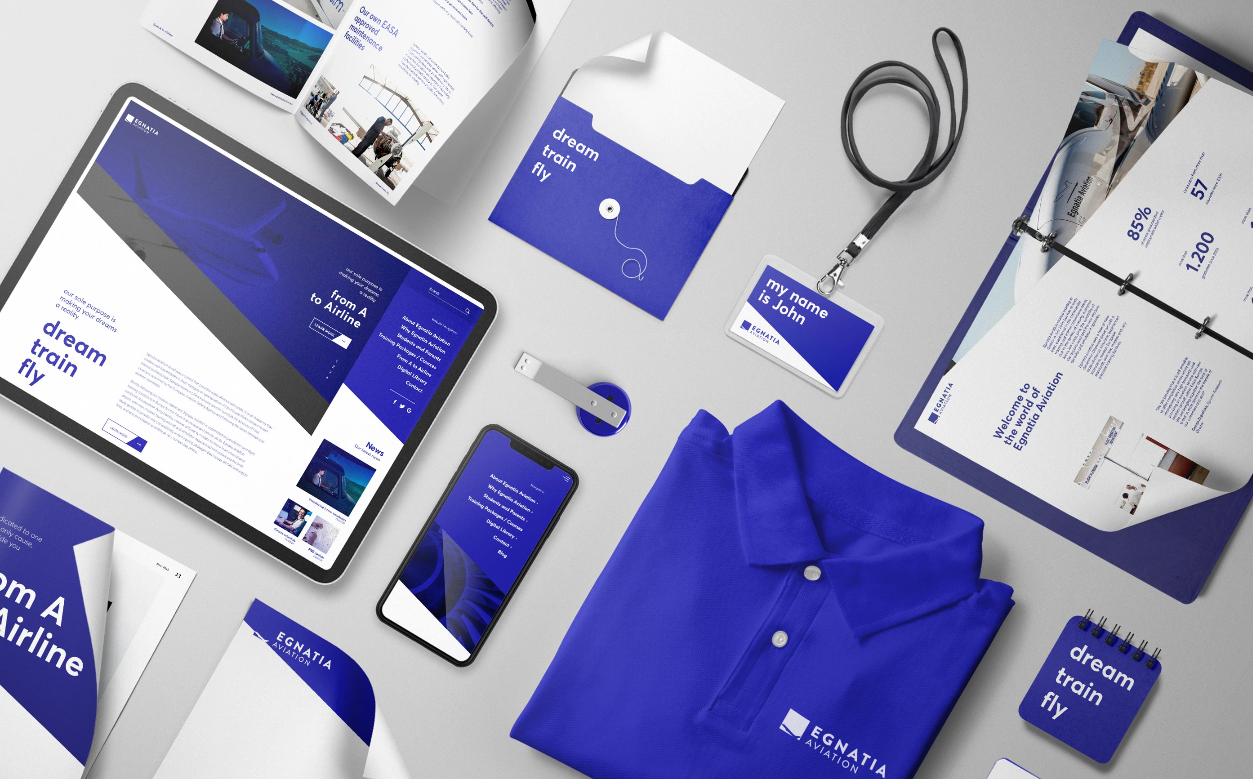
Full rebranding of Egnatia Aviation, by refreshing the visual identity and linking it with an integrated visual marketing code to convey the message of its status. Additionally elements of digital and printed communication material with quality content and clear CTAs.
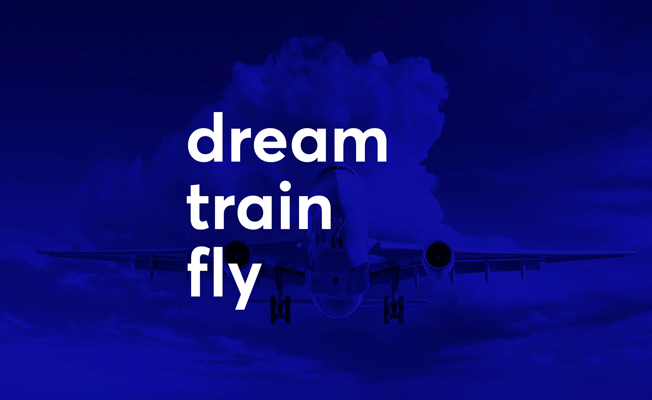
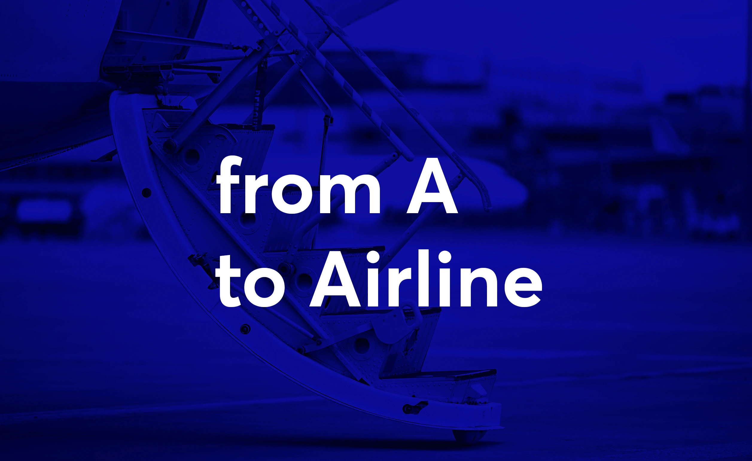
From A to Airline
This very philosophy of Egnatia Aviation is applied to the re-branding. The objective of reducing the distance between the acquisition of a pilot license and the actual job is reflected both in the company’s logo, with the geometric tilt of progress, and in the new motto “From A to Airline”, stating its immediacy of the procedure.
The motto “From A to Airline” is a comprehensive statement of purpose with generalised targeting, both internal and external. In direct contrast to the phrase “From A to Z”, the complete statement of the “destination”, its direct link to the identical first letter, makes clear the immediacy of the process, with a clear reference to the object itself.
Font Analysis
Typography plays an important role in communicating an overall tone and quality. Careful use of typography reinforces our personality and ensures clarity and harmony in all Egnatia Aviation communications. We have selected Brandon Grotesque and Averta, which help us inject quality and enthusiasm into the entire Egnatia Aviation communication strategy.
A School in which the internal recipients of the brand’s messages change so often, it is essential to be able to communicate in a direct and clear way. For this purpose, the motto and the slogans of the School are highlighted in bold. Bold typography allows better absorption of the messages and therefore it is ideal for promoting the statements, the beliefs and the ideas of Egnatia Aviation.

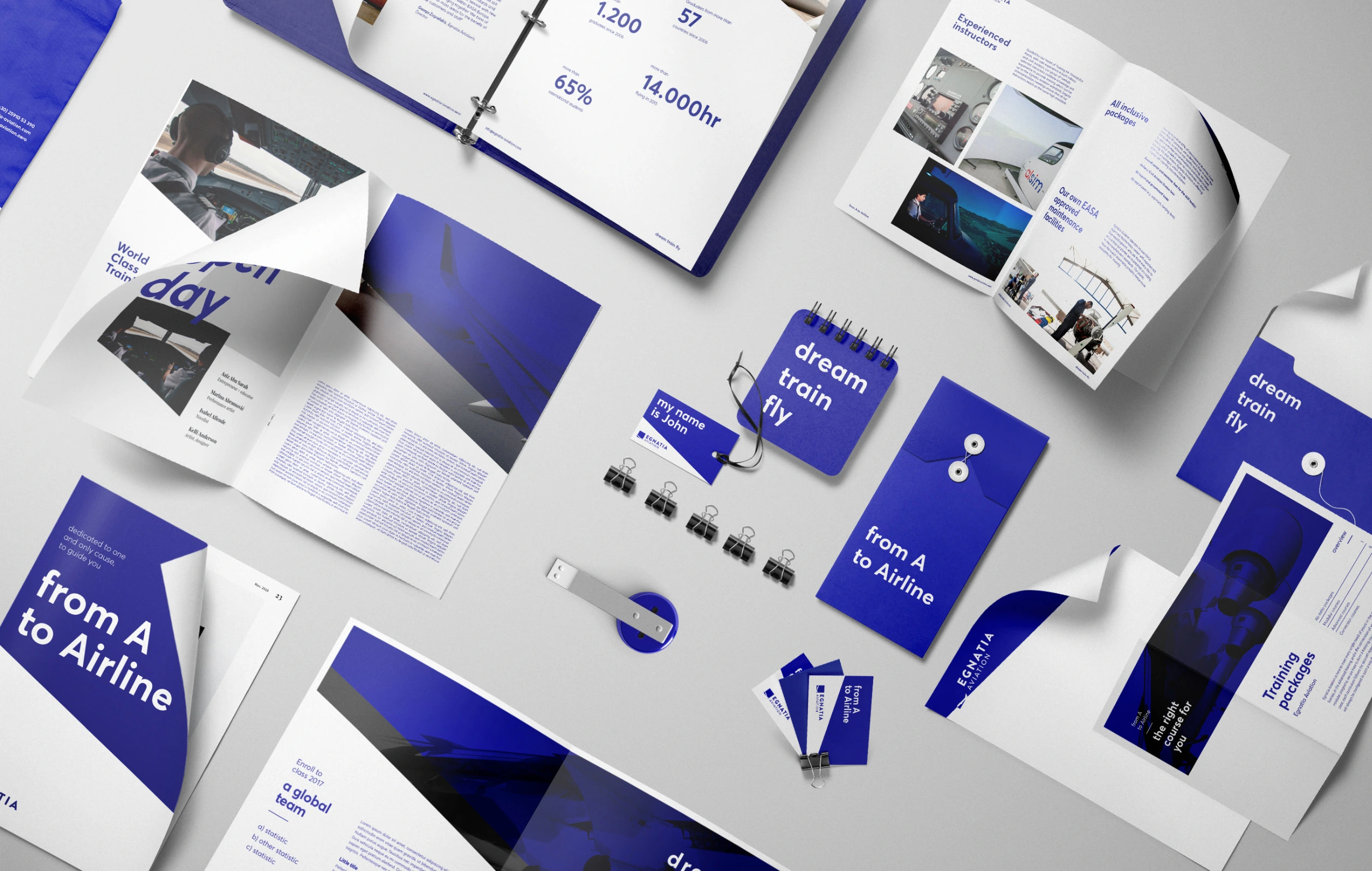
Corporate Identity Application
The renewal of the corporate identity has a second dominant part, which consists of its application in the whole of the printed and digital corporate material of communication. More specifically: Egnatia Aviation’s new letterhead follows the lines and the philosophy of the logo, with its tilt angle and the incorporation of the logo itself, features clearly the visual message of the whole design.
The very same philosophy has been applied to both envelopes and business cards of Egnatia Aviation, while it has already been extended to all the student applications and the appearance of the vehicles’ fleet. The universal application of corporate identity in all communication and promotion media contributes to a clear and harmonious image of the Egnatia Aviation’s Philosophy -and its meaning- to all the recipients.