Forno – Rebranding & Packaging Design
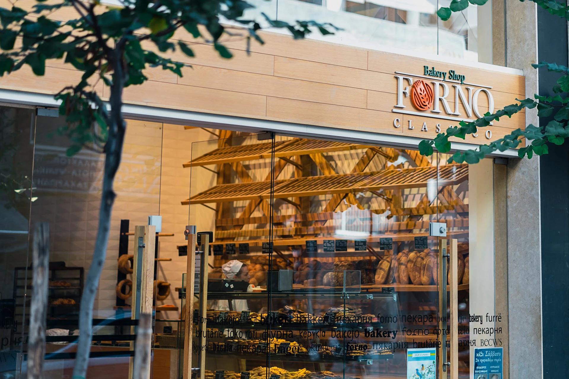
Combining rebranding and packaging, the creative challenge becomes far more interesting. And that was exactly the case considering the related to Forno Classico chain of bakeries project by Artware. This process resembles more or less a game of balance between the familiarity of the old image and the re-establishment of a new, fresh marketing approach through both brand and package.
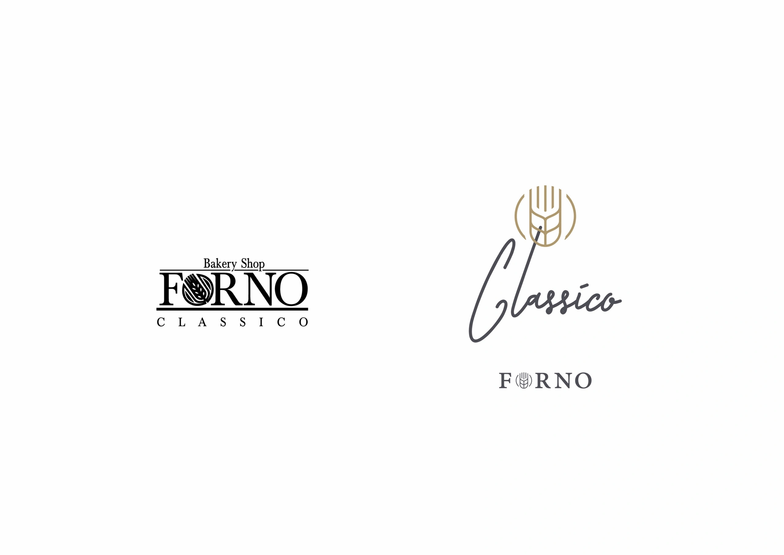
Branding strategy and packaging for the Forno Classico bakery, creating a substantial transition from the old to the new, from the general to the specific, from the traditional image to the modern identity, but without losing those elements that constitute reference points for the current and the targeted audience.
The new brand for Forno Classico was presented in “Favourite Design” international edition as “featured in Branding”, while the new packaging was proudly featured on package design inspiration archive “Packaging of the World” website as a “favourite design” and in the edition of “Minimalist Packaging”.


From Classic to Elegant
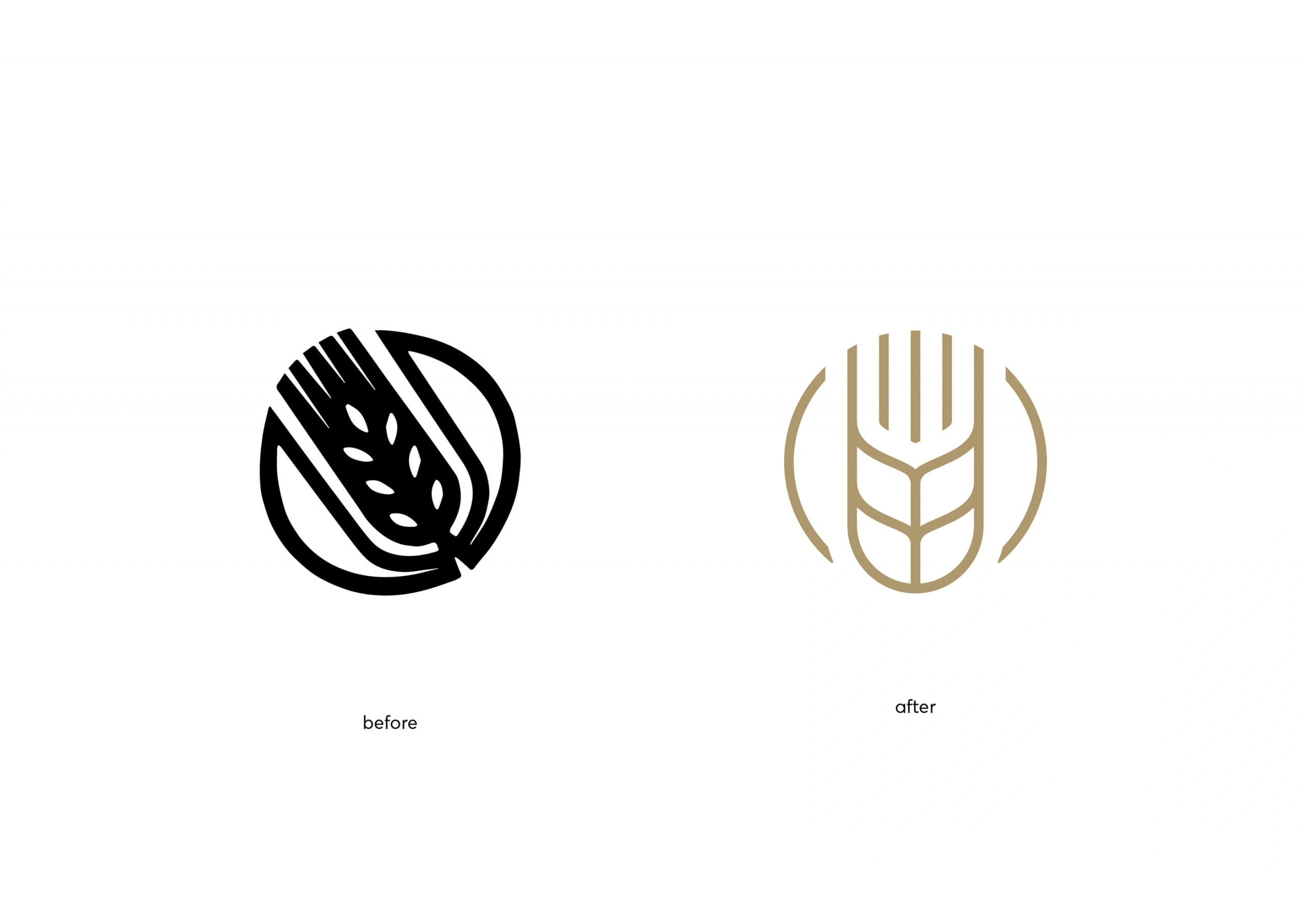
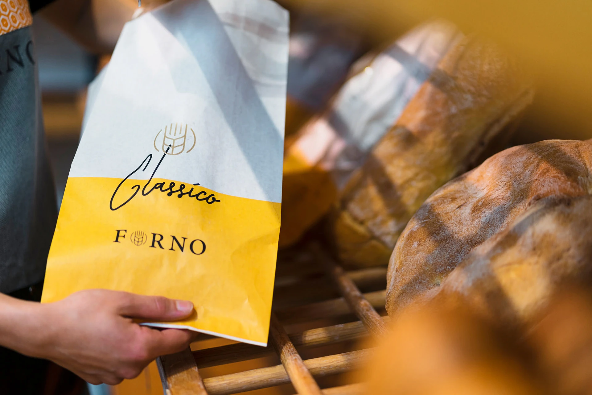
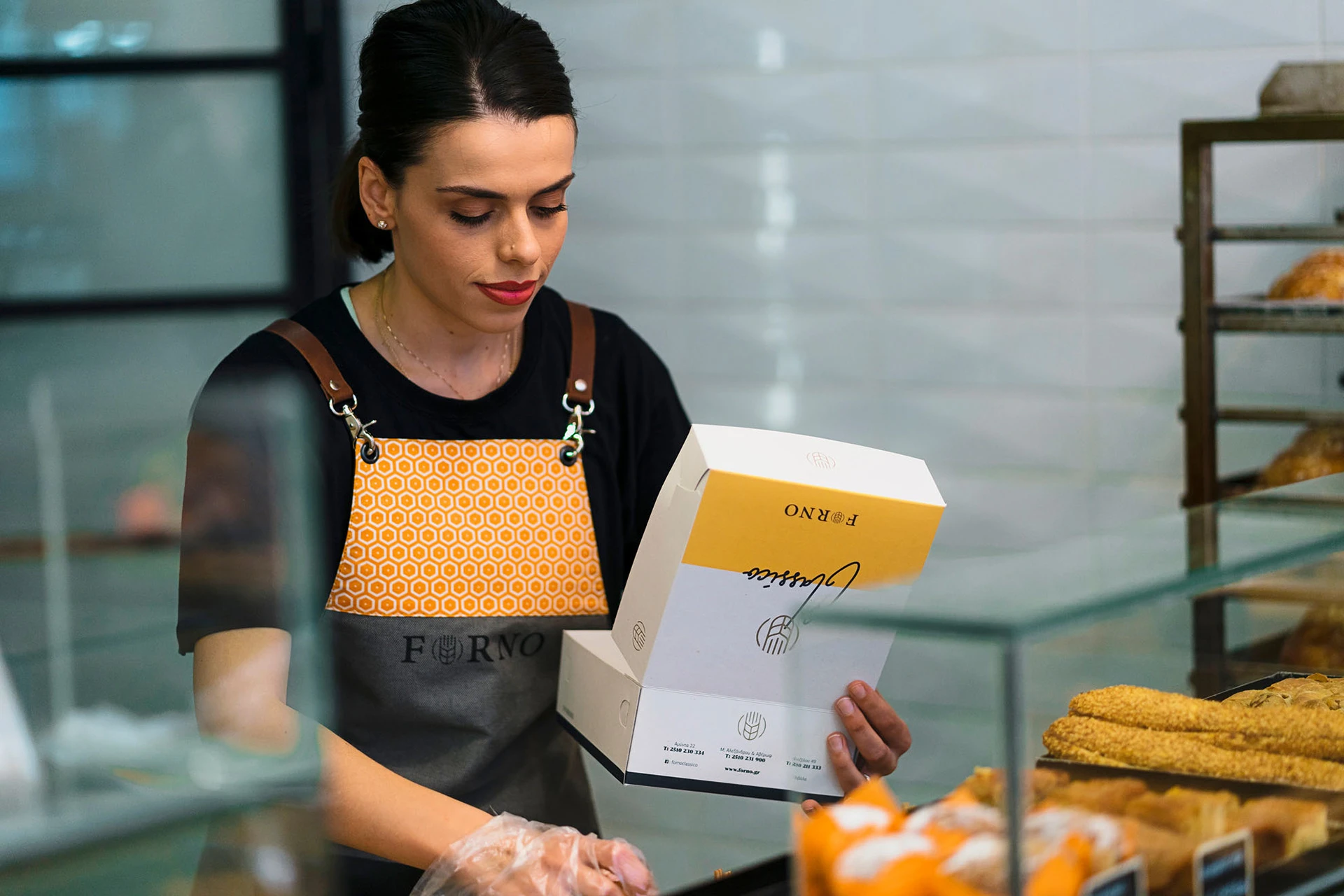
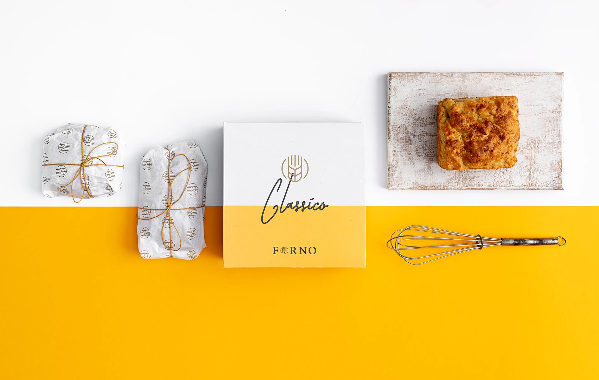
We approached the Forno Classico’s branding by highlighting its “ingredients” through their clear presentation. The adaptation of the uniform mass of the previous logo to a clear triplet of distinctively placed elements, but also the choice of immediacy given by the handwritten presentation of the term “classic”, in correspondence with the handmade product, were the key elements of the typography. The selection of the colour code was also made on the exact same basis, with a direct reference to the product and under the spectrum of the communication and marketing strategies.
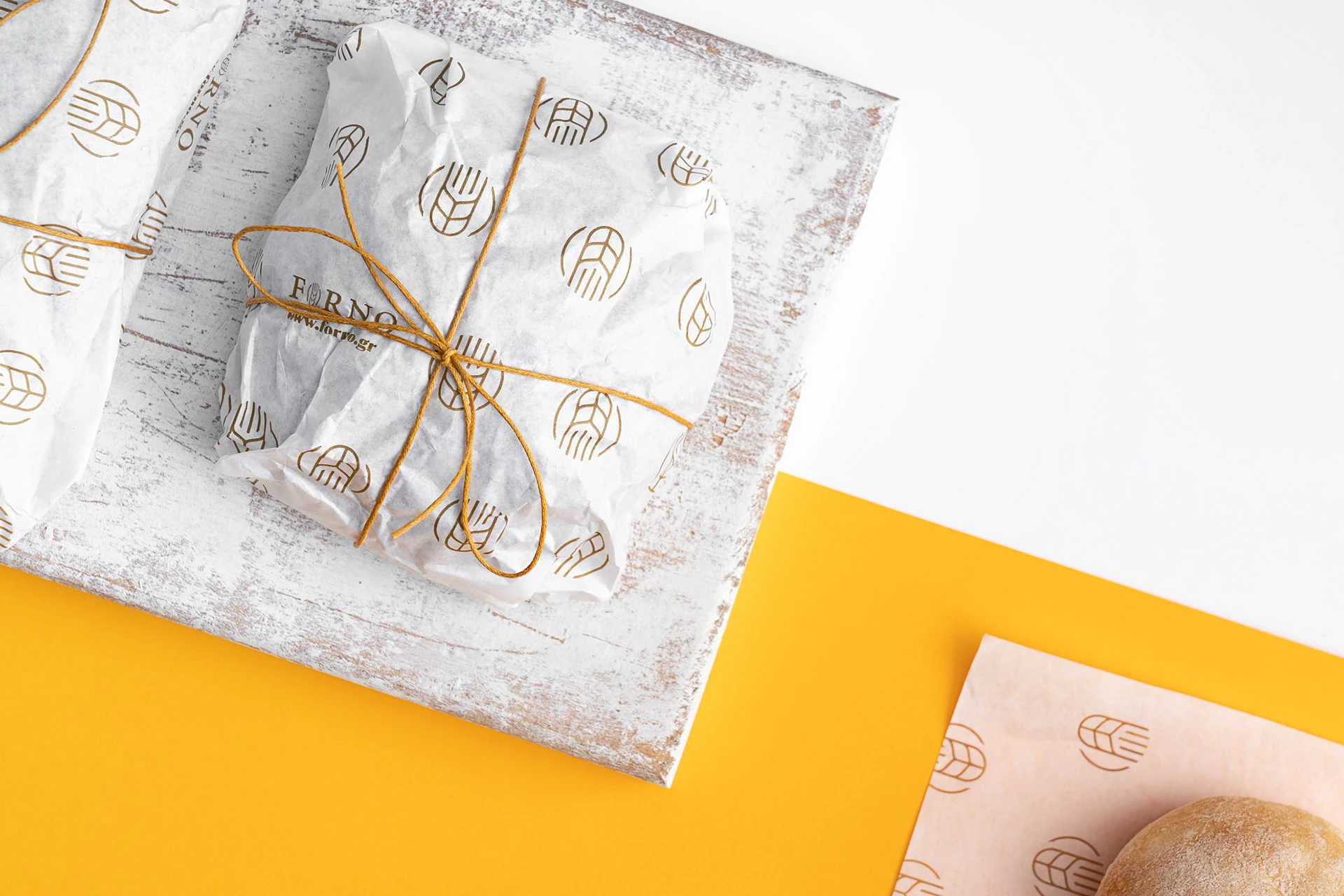
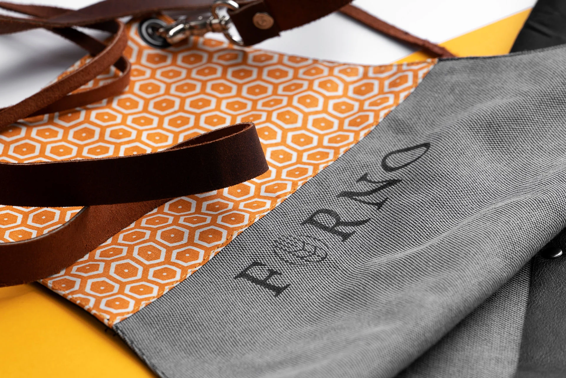
The corporate identity found direct application in the design of the new packages that combine the linear pattern with the graded levels. The crystallised depiction of the branding elements and their smart adaptation were aimed, among other purposes, at highlighting the content itself.

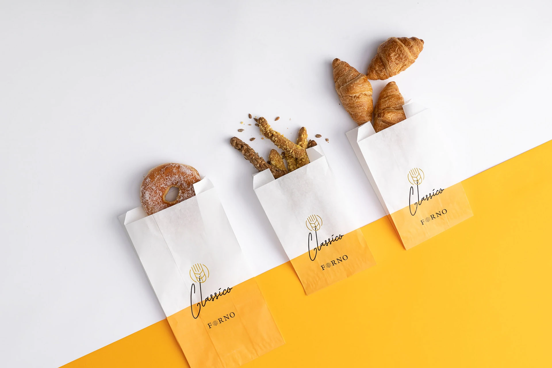

For the design of the new packaging of Forno Classico bakery products, we chose the purest version of the products’ colour palette, in white and yellow, thus highlighting the product itself. We applied the corporate identity to a multitude of packages of different sizes, to serve all packaging needs, while adding inside the boxes a printed motto, telling its own story of pleasure.